


The world of branding is a vibrant canvas where choosing logo colors plays a pivotal role. It’s not just about the aesthetics; colors hold immense significance in how brands are perceived. They can evoke emotions, convey messages, and establish consumer connections.
In logo design, understanding color psychology logos isn’t merely a choice; it’s a strategic necessity.
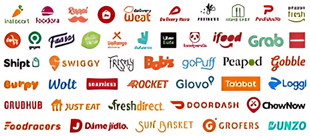
Regarding Color psychology in logo design, each color choice isn’t arbitrary; it’s a deliberate attempt to create a specific impact. Their role in shaping brand identity is substantial, making them a cornerstone of effective logo design.
Understanding Color Meanings
Colors are more than pigments on a palette; they carry profound meanings and evoke diverse emotional responses. Each hue holds a unique psychological association, influencing how individuals perceive and react to visual stimuli.
- Red: Often associated with passion, energy, and urgency. It can create excitement or a sense of urgency, making it a common choice for brands seeking attention.
- Blue: Symbolizes trust, professionalism, and serenity. It instills a sense of reliability and calmness, frequently used by tech companies and financial institutions.
- Yellow: Radiates optimism, happiness, and creativity. It’s vibrant and attention-grabbing, often employed by brands aiming to convey a cheerful or innovative image.
- Green: Reflects nature, growth, and harmony. It’s frequently used by eco-friendly or health-related brands, aligning with themes of sustainability and wellness.
- Purple: Associated with luxury, creativity, and wisdom. It embodies sophistication and creativity, appealing to brands seeking an aura of exclusivity.
- Black and White: Signify simplicity, elegance, and neutrality. They evoke a sense of timelessness and can be a powerful choice for brands aiming for a minimalist or sophisticated image.

Source: Creative Live
Factors to Consider Choosing Logo Color
Selecting the right color for a logo involves strategic thinking and an understanding of the brand’s identity and audience preferences.
It’s not just about picking visually appealing colors. It’s about creating a meaningful connection between the brand and its consumers.
Target audience analysis
Understanding the target audience’s demographics, cultural backgrounds, and psycho-graphics is fundamental. Different age groups, cultures, and regions may respond differently to colors due to their unique associations and experiences.
Analyzing these preferences helps in logo color matching that resonates deeply with the intended audience, forging a more impactful connection.
Brand personality alignment
Every brand has its personality, values, and voice. The colors selected should harmonize seamlessly with these brand attributes. For instance, a brand aiming for a fun and youthful image might lean towards vibrant and playful colors like orange or bright green.
In contrast, a luxury brand might opt for more elegant and best colors for business logo, like deep purples or rich gold, to reflect exclusivity and opulence.
Creating Harmony with Color Combinations
It’s essential to choose a suitable color psychology logo and harmonize it effectively. Balancing color combinations involves understanding the relationship between different hues and utilizing their interactions to create a visually pleasing logo that effectively communicates the intended message. Here are two essential approaches to achieving color harmony in logo design:
Complementary, Analogous, and Monochromatic Schemes:
- Complementary Colors: These are pairs of colors from opposite sides of the color wheel, such as red and green or blue and orange. When used together, they create a striking contrast that draws attention.
- Analogous Colors: These colors sit adjacent to each other on the color wheel, like blue, green, and teal. They provide a more subtle and harmonious effect, ideal for conveying a sense of unity and cohesion.
- Monochromatic Colors: Utilizing variations in shade, tint, or tone of a single color creates a monochromatic scheme. It offers a sophisticated and elegant look while maintaining simplicity.

Source: Render Forest
Balancing Contrasting Colors for Visual Appeal:
Combining contrasting colors effectively is an art. Too much contrast can be overwhelming, while too little may lead to a lack of visual interest. The right balance is key to creating a visually appealing and memorable logo.
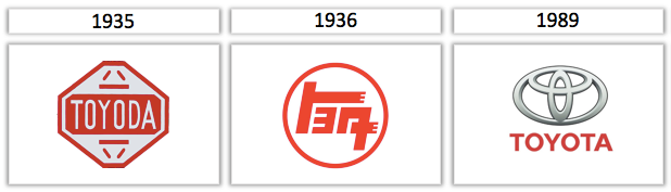
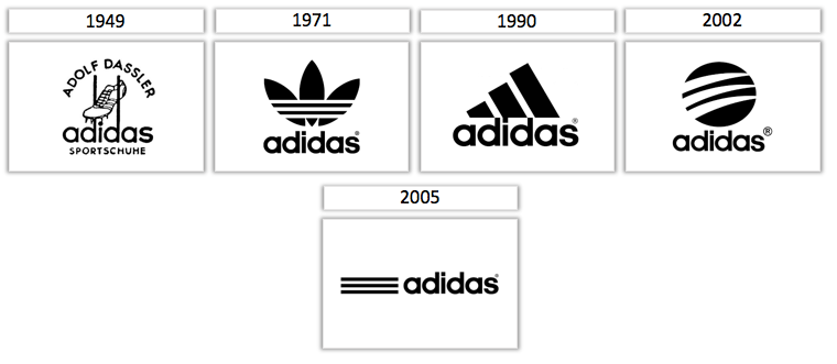
The Evolution of Logo Colors Over Time
The colors chosen for logos have undergone significant transformations across different eras, often influenced by prevailing trends and cultural shifts. Understanding this evolution sheds light on the dynamic nature of design trends and color preferences in logo design.
Trends in Logo Color Choices Across Different Eras:
- Past Eras: In earlier times, logos often leaned towards simple color schemes, with black, white, and primary colors dominating. These colors reflected a sense of timelessness and clarity.
- Mid-20th Century: The 1950s and 1960s witnessed a surge in vibrant and bold color choices. Brands began embracing a broader spectrum of colors to stand out and express creativity.
- Late 20th Century to Present: The late 20th century saw an influx of colorful and diverse logos, often incorporating gradients and shades to convey depth and modernity.
Source: Tailor Brands
Impact of Cultural Shifts on Color Preferences:
Globalization and Cultural Fusion: With globalization, color preferences have become more diverse and interconnected. Brands aiming for global reach consider cross-cultural implications, leading to more versatile and inclusive color choices.
The evolution of logo colors reflects trends and responses to societal changes, technological advancements, and shifting cultural landscapes. Colors that resonate well in digital formats, such as vibrant and contrasting hues, have gained prominence.
FAQs
How to change the color of a logo in In Design?
Open the logo file, select specific elements, access the “Swatches” panel, and apply a new color.
How to change logo colors?
Use software like Adobe Illustrator or Photoshop. Open the logo file, select elements, pick new colors, and apply them.
How to choose the logo color?
Consider brand message and audience, delve into color psychology, test different colors, and ensure alignment with brand identity.
What are the best colors for a logo?
Choose colors that evoke desired emotions or traits, considering your brand, audience, and message.
Conclusion
Choosing a logo color involves understanding the psychology behind each color, considering what your audience likes, and reflecting your brand’s personality. It’s not just about pretty colors; it’s about speaking to emotions, values, and identities without using words. You must carefully analyze colors, avoid common mistakes, and test choices with surveys and data to get it right.
This ensures your colors genuinely connect with your audience and create a strong visual identity for your brand. Colorful logo design shifts as society changes, reflecting new perspectives and values. Picking the best logo colors is an art that combines creativity, psychology, and foresight. Best color for logo you choose aren’t just for show; they capture the heart of your brand, building connections and making a lasting impression on your audience.